First up was making the Ambient light nicer. Below is screenshot of how it looks in HPL2:
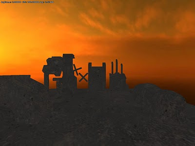
This is just a uniform color blend that has been added and does not look very. It is quite hard to see any details when there is a uniform texture such as in the screenshot above. To get nice ambient lighting what you need to do is to somehow simulate global illumination. Light does not just hit an object and then stop, but bounces around and scatters color from nearby on each other. There is a lot of research into this and most of it require one to pre-calculate the result in one way or another.
I settled with something really simple called hemispherical lighting, which basically mean to have separate up and down (sky and ground) colors and then blend them depending on the normal of the surface. My first idea was to use cubemaps to do something similar, but since the cubemap needs to be very blurred, using hemispherical lighting gave pretty much the same result and is a lot faster. Here is the result:
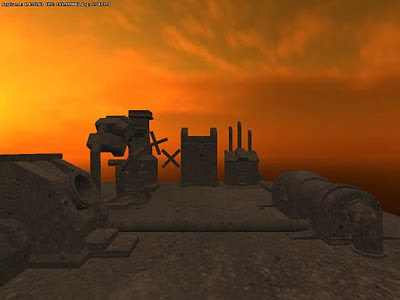 Now it is a lot easier to see details and looks a lot better.
Next up was the direct lighting from the sun and this was quite simple. I could just add some tweak to the existing shaders and make it work. Basically sunlight is just like normal light but without any position or attenuation. This means every pixel is lit from the same direction and strength is independent of distance to the source (as it does not have a position).
Here is how the scene looks when we add that too:
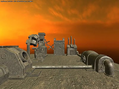
Much nicer, even though the texture is a bit boring. Note that there now is specular because of the direct light from the sun.
Finally, lets move on to the shadows! The engine already feature the basic shadow rendering though a technique called shadow maps. What is the big problem now is to make it look good over long distances. Since shadow mapping works by rendering from the light's point of view, doing shadows from an omnipresent light source gets a bit complicated. The simple solution is to use a really large shadow map, but then you would get very bad resolution near the camera.
What you do instead is to use the fact that objects take up smaller space of the screen the farther away they are. So the idea is to use the shadow map in such a way that you give more room for pixel nearby and less to those far away. This is something that has been researched quite a bit and there are various techniques to achieve this. One solution is to warp the projection when rendering to the shadow map. This comes with a lot of issues though and is very rarely used in games.
Instead most games use a technique called Cascaded Shadow Maps or Parallel Split Shadow Maps. The way this works is that the view frustum (a geometrical shape encompassing all the camera sees) is split into several parts and a shadow map is given to each split. This means that the first split, which is right in front of the camera, gets a much larger shadow-per-pixel ratio than the last split, which is much larger, but further away (and hence has small on-screen pixels).
The algorithm itself is pretty easy, especially since there is quite a few papers on it. The big problem is that you can get some flickering results because the shadow map can change a lot. There are published techniques that solve this fairly easy though. Most of my time was instead spent on making it work with the rest of the engine. This is something that might not be that known to non-programmers, but most of the work is often not in the algorithm itself but fitting it into the engine design. I think I spend a 3-4 days on getting it inside the engine, before I had everything set up as it should. The actually algorithm took 2 days or so.
Here is how it looks:
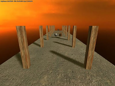 Note how shadows are detailed up front, yet they are cast all the way into the distance.
Here is how the shadow maps look (I combine all into a single one):
Now lets add this to the image I started with:
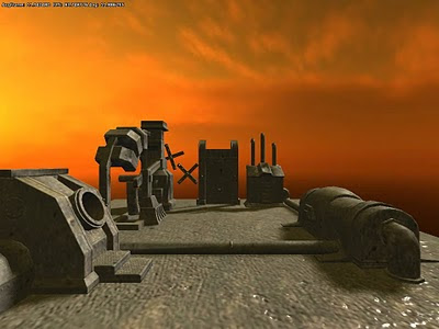 And lets add some nicer texture while at it:
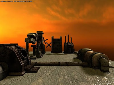 There! Sunlight with shadows is in!
My next job will be to update the very core of the renderer with something called a Light Pre-Pass Renderer. More on that in a later post!


+rev.jpg)
0 nhận xét:
Đăng nhận xét